

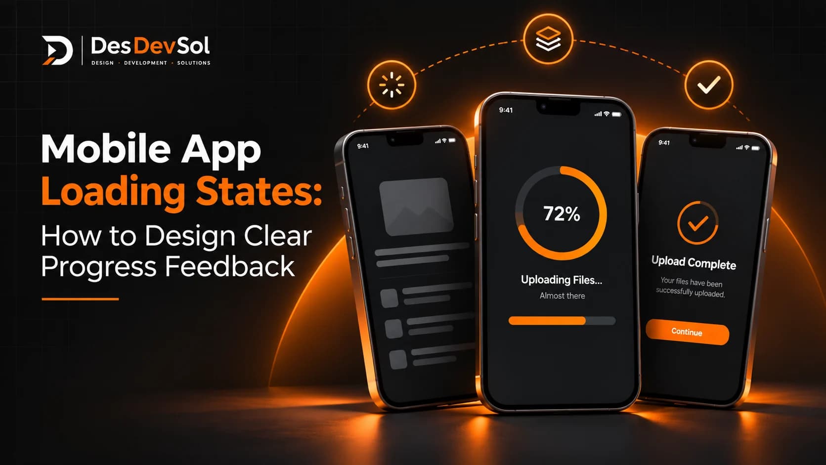
Mobile app loading states help people understand what is happening when content or an action takes more than a moment. A blank screen can look like a crash, while an endless spinner gives no clue whether the app is working. Clear loading feedback sets expectations, protects confidence, and helps users decide whether to wait, continue elsewhere, or try again.
The goal is not to add animation to every pause. It is to show the right amount of information for the task, without promising progress the app cannot measure.
1. Match the loading state to the task
Start by identifying what the app is waiting for. Opening a product list, saving a profile, uploading a document, and processing a payment are different actions. They should not all use the same full-screen spinner.
- Loading content: Show the structure of the content that is on its way, when that structure is known.
- Submitting a short action: Give feedback near the button or control that was used, and prevent accidental duplicate taps while the request is active.
- Completing a longer task: Explain what is happening and show measurable progress when the app can calculate it.
- Refreshing existing content: Keep useful content visible where possible and indicate that an update is underway.
Apple’s loading guidance recommends showing content as soon as possible and using placeholders while the real content becomes available. The practical lesson is simple: do not make people stare at an empty screen when the app can show useful context.
2. Choose between a spinner, skeleton, and progress bar
Use a spinner when the duration is unknown
A spinner communicates that work is in progress, but it does not tell people how much remains. It can work for a brief request, such as checking a form or refreshing a small section. Keep it close to the action or content it relates to rather than blocking the entire app without a good reason.
Use skeletons for familiar content layouts
A skeleton screen shows a simplified outline of the content that will appear—for example, product cards, a profile, or rows in an order list. It helps users understand that content is being fetched and where it will appear. Match the placeholder to the final layout and replace it cleanly when the data arrives. Avoid using a skeleton for a tiny action that does not need a full content placeholder.
Use a progress bar only when progress is measurable
If the app can reliably estimate how much of a file upload, download, or multi-step process is complete, a determinate progress indicator gives users more information than an endless animation. If the duration or percentage is not known, do not invent a number. Use an indeterminate indicator and describe the task clearly instead.
Apple’s progress indicator guidance distinguishes between tasks with known progress and tasks whose duration cannot be quantified. Android’s platform guidance makes the same practical distinction between determinate and indeterminate indicators.
3. Write status messages that explain what is happening
Labels such as “Loading…” or “Please wait” may be enough for a very short pause, but they are not helpful for every task. Use specific language when it reduces uncertainty:
- “Checking availability…” instead of a vague message during a booking check.
- “Uploading your document…” when a file is being sent.
- “Saving changes…” while a profile update is in progress.
- “Syncing your latest orders…” when the app is updating order information.
Only state what the app actually knows. Do not show “Almost done” without a reliable basis, or display a percentage that jumps forward merely to make the wait look shorter. If a task can take a while, explain what is happening and whether the user can safely leave the screen.
4. Keep the app useful while work continues
A loading state should not automatically lock the entire interface. When it is safe, let users continue reading already-loaded information or move to another section while background work finishes. For example, a shopping app might keep product details visible while refreshing stock availability.
There are exceptions. A payment submission or another action with a meaningful consequence may need a clear in-progress state and protection against duplicate submissions. Decide what can remain interactive based on the operation, not on a blanket rule that every screen must be disabled.
5. Design the end state, not just the wait
Every loading state should have a defined next state. When the request succeeds, replace the placeholder with real content and confirm important actions. When there is no content, show an appropriate empty state. When the request fails, explain the problem in plain language and offer a safe next step.
For example, if an order list cannot load because the connection dropped, the app could keep the last available information visible, explain that it may be out of date, and offer a retry. Do not leave a spinner running indefinitely after a request has failed. For sensitive or transaction-like actions, check the result before inviting the user to submit the same action again.
6. Make loading feedback accessible
Do not communicate status through motion or colour alone. Make sure assistive technologies can discover meaningful status changes, controls have clear labels, and the loading animation does not create unnecessary distraction. Respect reduced-motion preferences where applicable, and check contrast and text scaling.
Keep the message concise. Repeated announcements every time a progress value changes can become noisy, so announce useful milestones rather than every tiny update. Test with screen readers as well as visually, on the devices and operating systems your app supports.
7. Test real waiting conditions
A loading design that looks fine on a fast office connection may behave differently on a slower network or an older device. Test at least these cases before release:
- The request finishes quickly and the loading indicator does not flash unnecessarily.
- The request takes longer than expected and the interface still explains what is happening.
- The user leaves and returns to the screen while work is underway.
- The network disconnects, the request times out, or the server returns an error.
- The user taps the action repeatedly or tries to cancel it.
- The request succeeds but returns no results.
- Screen-reader, text-scaling, and reduced-motion settings are enabled.
Track where loading begins and ends, how often requests fail, and whether users abandon the flow during long waits. Use those observations to improve both the interface and the underlying performance. A polished spinner cannot compensate for a request that is unnecessarily slow.
A practical checklist before launch
- Each important async action has a clear loading state.
- The pattern fits the task: spinner, skeleton, or measurable progress.
- Status text is specific and never invents timing or percentage.
- Duplicate submissions are prevented when necessary.
- Success, empty, failure, timeout, and cancellation states are designed.
- Users can continue elsewhere when it is safe to do so.
- Accessibility and slow-network conditions have been tested.
Good mobile app loading states do not make every wait disappear. They make waiting understandable and give people confidence that the app has not stopped responding. If you are planning a new app or improving an existing one, explore DesDevSol’s mobile application development service to discuss the user experience your product needs.